✍️
Note
Heads up! Phase gets little updates and improvements all the time. Our tutorials might be a tad different from the current app.
Getting Started with Phase
Phase is a product designer's best friend. Our tool comes with a user interface that's intuitive for beginners and familiar to industry professionals. This article contains everything designers need to know to get started. Welcome to our tour of Phase.
✍️
Just a Heads-up
Phase works best on Google Chrome. For the smoothest experience, we recommend using Chrome.
Welcome to Phase
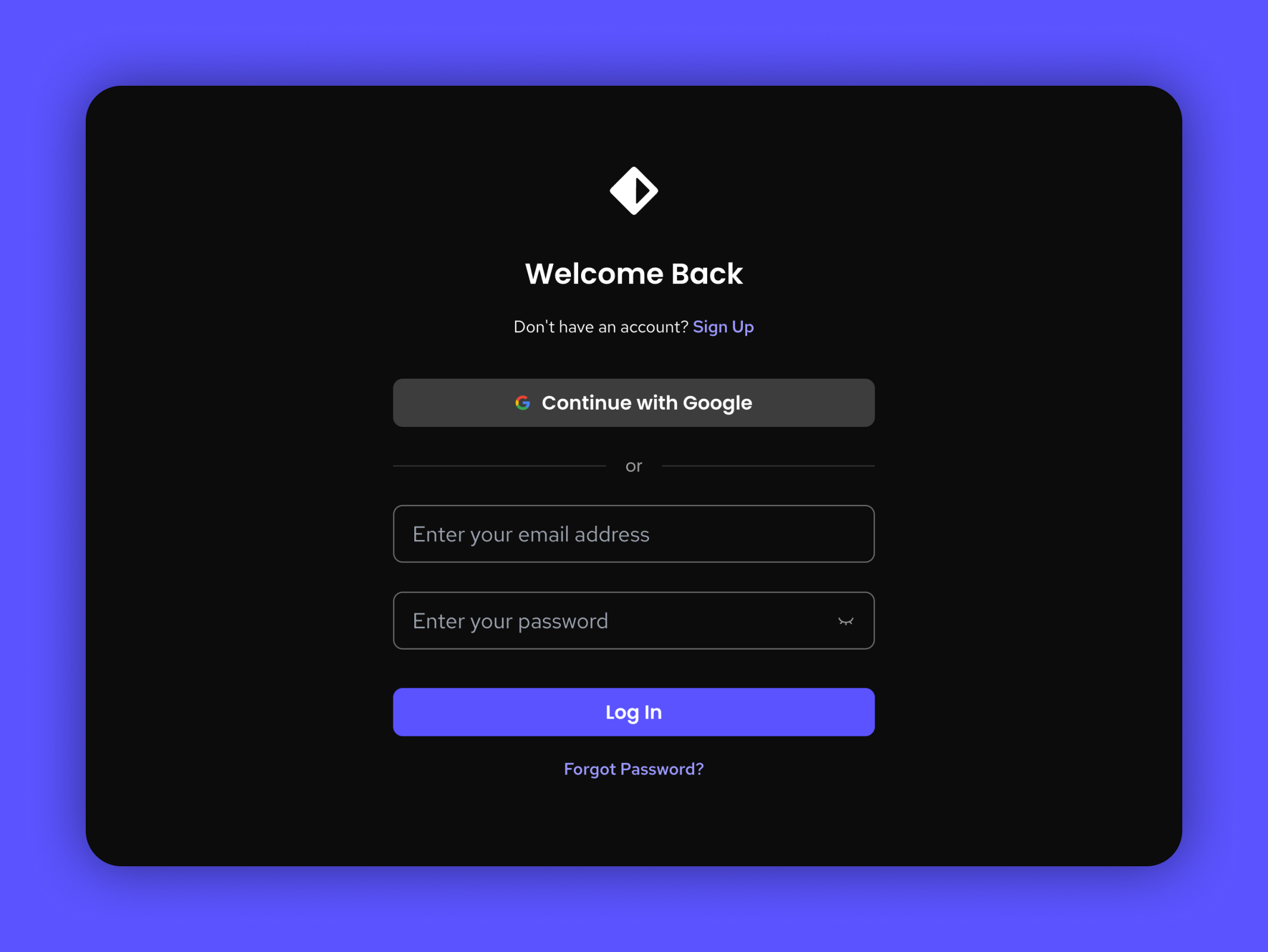
When we open Phase, we'll have the option to either sign in using our email or our Google account. First time users will need to create an account by clicking sign up.
After we've signed in, the next page we'll come across is our Dashboard Interface. It's the place where we can create, open, or manage our designs.
Dashboard Interface
The Dashboard
The Phase dashboard is our starting point. This is where we handle files, projects, teams, and preferences. It's our main control panel and storage server all rolled into one. We have a dedicated article about the Dashboard that goes into the specifics, but here are the two main things that we might do if we're trying to jump into the Phase editor.
Importing
For Lottie (.json/.lottie) files, we can directly import them into Phase as a file for editing. We simply click the Import button, select a Lottie file from our device, and Phase will automatically create a new draft with our imported animation ready for editing. Learn more about importing by reading our dedicated article about it here.
Creating New Files
Alternatively, we have the option to create a new file from scratch directly in Phase by clicking on the New button. This will literally give us a blank canvas to work with.
Phase Interface

The Phase UI starts out fairly minimalistic, expanding to show more options when we select items on your canvas. The canvas is our main design space, similar to an “Artboard” in other software.
1. Menu Bar

This is a mashup of what we typically find in “File”, “Edit”, and “View” sub-menus in traditional software.
- Go To Dashboard: Returns to the file hub of Phase so we can open other drafts.
- New: Starts a new draft while keeping our current draft open.
- New File From Lottie or Phase: Imports and opens a file from our device.
- Export: Saves a GIF, MP4, or Lottie to implement into our web page.
- Several common editing functions, as well as references to their hotkeys.
- View toggles for the Ruler, the Panels, and the Origin.
- Snap to Pixel Grid: Enables or disables pixel snapping, which aligns to a Pixel Grid in the background.
Some of those options refer to functions of our canvas. Here's a brief description of each of them.
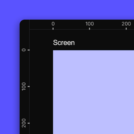 Ruler |  Origin |  Pixel grid |
- Ruler: Numbered pixel guides on the top and left side of the canvas.
- Origin: The point where the element is located, regardless of the element’s size or shape. When the element is created, the origin point is set to its center, but that point can be moved. Check out our page dedicated to the Origin if you want to learn more about it.
- Pixel Grid: Phase dimensions are tracked in pixels, and when zoomed in far enough, the units are visualized in a grid.
 Layer panel | 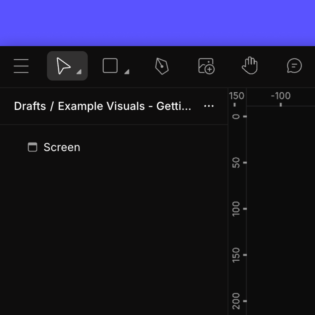 Toolbar panel | 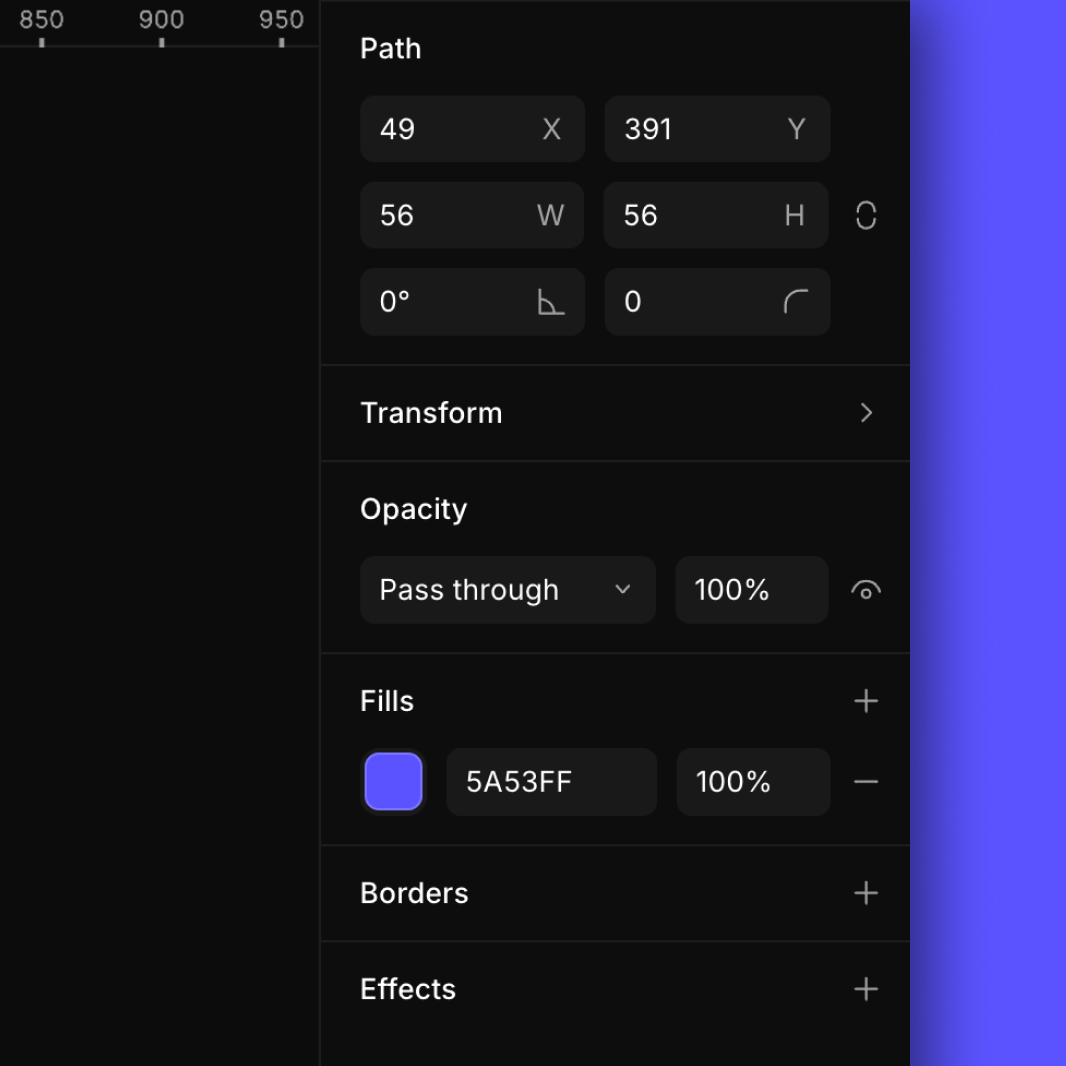 Properties panel |
Panels: The interactive spaces on the top and sides of the screen, comprised of the Layers panel, the Toolbar panel, and the Properties panel. The Toolbar is described below, and the Properties panel is only shown if you have an element selected.
⚠️
Warning
If we hide the panels, we won't be able to see the Menu Bar. To recover the panels, we can right click on the interface, and a context menu will appear with the Show/Hide panels option. Otherwise, we can return the panels by pressing
Command ⌘
or
Ctrl
2. Toolbar
Select items, create shapes, draw paths, or pan around the scene. We’ll be coming back here often as you craft our masterpiece.
Select 
The standard cursor that opens an element’s properties, allows movement around the canvas, and lets you directly change the height and width of an object. Dragging from the edges with the Select tool adjusts the size property (height and width).
Scale 
An alternative cursor that adjusts an element's scaling rather than its size dimensions. Dragging from the edges with the Scale tool adjusts the scale property, scaling the element’s visual appearance by a percentage from the origin. This can stretch vectors and border sizes, differing from simple resizing.
To activate the Scale Tool, press
K
Rectangle 
Creates a four-sided, right-angled shape. After adding a shape to the canvas, the element properties panel opens up, so we can modify and animate it in various ways.
Oval 
Same as above, but with circular shapes.
Container 
Makes a grouping object that can be used to combine multiple shapes together and adjust them all at once. If created this way, it also acts as a rectangle shape, and has most of the same properties.
Pen 
A pen tool that makes sets of points to form complex shapes. Paths have additional settings not found in basic shapes, but after they are complete, they can be modified the same way as others.
Hand 
Grab the canvas and move it to better see the design’s details.
To activate the Hand Tool, press
H
Mask 
A mask tool that enables users to selectively reveal or conceal portions of layers, facilitating intricate and controlled visual effects.
Boolean 
Boolean operations are used for combining or subtracting shapes through operations like union, intersection, or subtraction to create complex and precise forms.
3. Collaboration, Export & Zoom
Collaboration

Our intuitive Presence UI is all about enabling buttery smooth teamwork. For example, user avatars next to the share button show who is actively collaborating and when each person last chimed in. This real-time insight keeps coordination smooth and effortless between co-designers. It's like they're right there together sketching out ideas!
For teams craving interaction, our multi cursor view and selection highlights enable seamless live collaboration. Names and colored cursors display exactly what co-designers are doing in sync. Teammates can watch sketches unfold together, following each contribution as it happens.
Export
When we’re done making a design or animation, or you just want to try it out on your web page, click the "Export" button to make a GIF, MP4, or Lottie.
To learn more about Export, read our dedicated article about it here.
Zoom

For more specific zoom controls, use the following hotkeys:
- To enlarge the view, press +
- To reduce the view, press -
- To Zoom to 100%, press Command ⌘0orCtrl0
- To Zoom To Fit, press Command ⌘1orCtrl1
- To Zoom to selection, press Command ⌘2orCtrl2
4. Layer Panel
The layer panel displays a hierarchical list of all elements within a project, offering a structured view of the design's composition. It enables users to organize, rearrange, and manage individual layers, facilitating efficient editing and control over the visual hierarchy of elements.
Additionally, it has a few toggles we should know about. The eye toggle is useful for adjusting the visibility of each layer, while the lock toggle serves to safeguard specific layers from unintended modifications when activated. These features exist to enhance the flexibility of our design editing experience.
We dive deeper into the intricacies of the Layer Panel in our article on Shapes.
5. Animate Slider
This is where the magic happens. Once we're ready to take our design to the next level, simply switch over to Animate mode by pressing the Animation Slider. When activated, Animated Mode adds a timeline to your canvas. This is our vehicle for adding motion to our design.
Nothing is off limits. All aspects of our design can be brought to life in Phase. Add a few keyframes, move elements around your canvas a bit, press play and voila. Our very first animation. Why stop at basic animation when we can implement path morphing, masks, trim paths and so much more into our designs.
To become an Animation wizard in Phase, read our article covering everything you need to know about Animation article.
6. Properties Panel
The Properties Panel is the place where we can make changes to the appearance of our elements, as well as set up other types of configurations. We have a dedicated page where we go into detail about all the types of adjustments and configurations.
Start Animating
Get Started with Our Free, Web-Based Platform.
Learn
© Phase Software GmbH 2025