Psychology + Design: Gestalt Principles as Solutions

Mhariell Mosqueriola
Riel is a Filipino Product Designer working as Lead UX Designer in Airfrov, a Singapore based e-commerce startup with the mission of connecting people to the best things around the world. She is a designer who loves solving human perceptions. Apart from these, she's also a speaker and loves sharing her knowledge through her Medium account.
Solving Problems by Understanding Human Behaviour
I have always believed that Psychology and Design comprise User Experience. Our profession entails empathy whenever we deal with human needs whose our goal is to solve. And as I continue to dive deep into where Psychology comes in the picture of Design, I then stumbled upon Gestalt Principles.
What is a Gestalt Principle?
Gestalt psychology is a school of thought that looks at the human mind and behavior as a whole. When trying to make sense of the world around us, Gestalt psychology suggests that we do not simply focus on every small component.Instead, our minds tend to perceive objects as part of a greater whole and as elements of more complex systems. This school of psychology played a major role in the modern development of the study of human sensation and perception.Source: verywellmind
This journey of discovering Gestalt Principle led me to a full understanding of how I can incorporate these principles into my design track. Thus in this article, I’ll be sharing with you of how I used these Principles as my design solutions to the following websites and apps I’ve encountered:
Disclaimer:The following design solutions provided are sample solutions using Gestalt Principles. Some design problems you’ll see will need redesigning, but I opted to stick with the original design and make it better using Gestalt. Thus if you have other design solutions, feel free to reach out to me. Also, I do not own all the images used. Credit to the owners.
- Proximity
The idea that when objects are placed in close proximity to one another, those objects are seen as a group rather than seen individually. Source: Hubspot blog
One example of how we can use Proximity in solving design problems can be seen below:
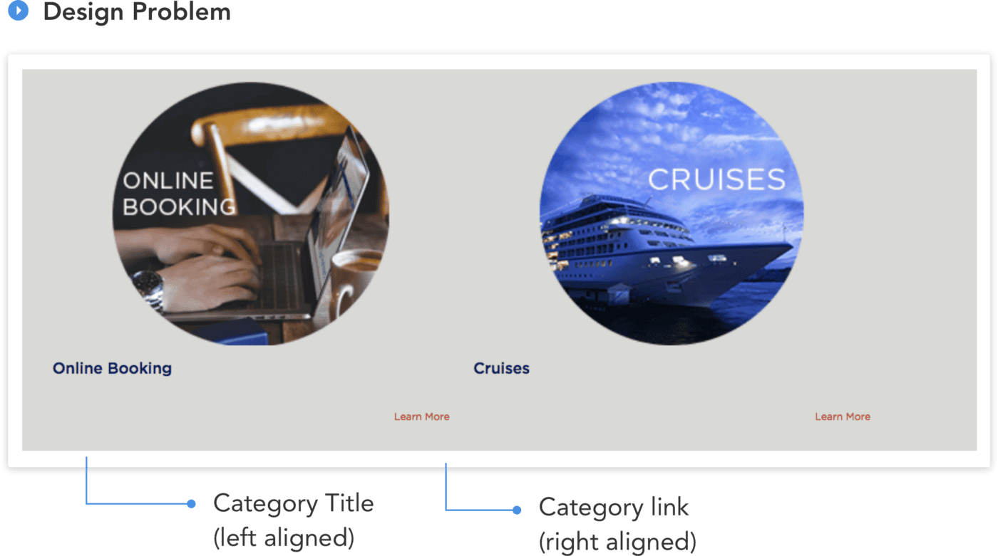
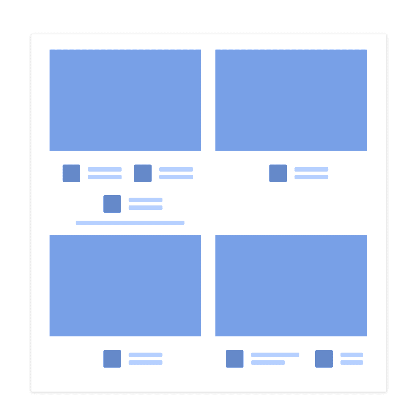
As we can see, the Category Title (Online Booking & Cruises) and Links (Learn More) are too apart from each other, which makes them look like floating elements. If we will create a wireframe out of them, it would look like this:
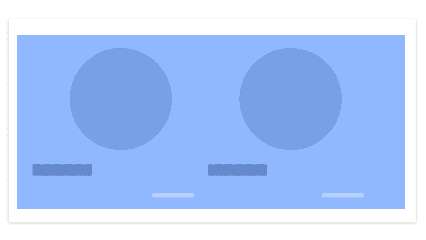
The whole component is out of context because nothing ties together the image, title, and link. Thus Proximity comes in as our solution. From having three individual elements floating in outer space into making them as one whole component:
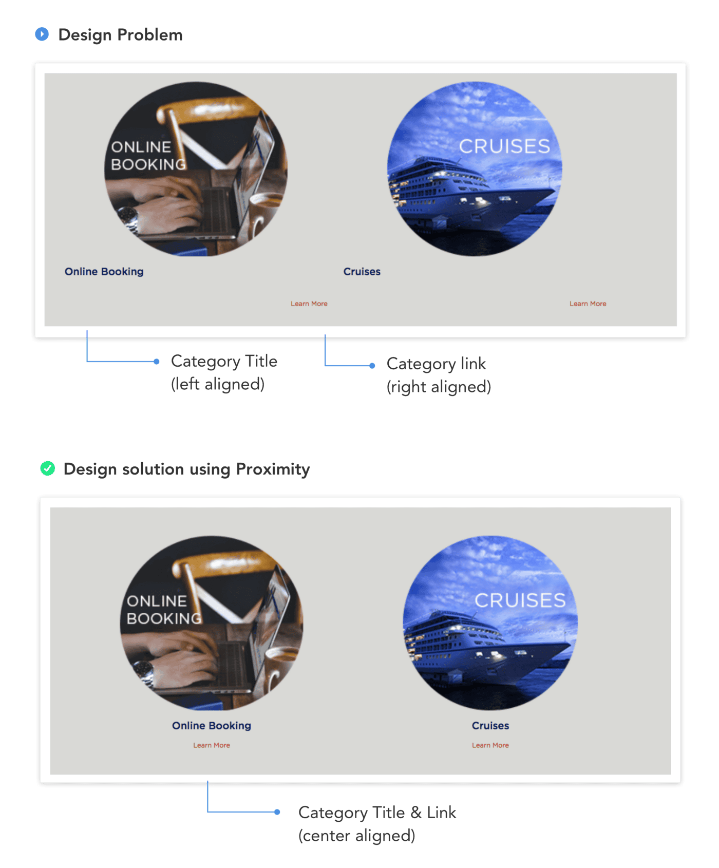
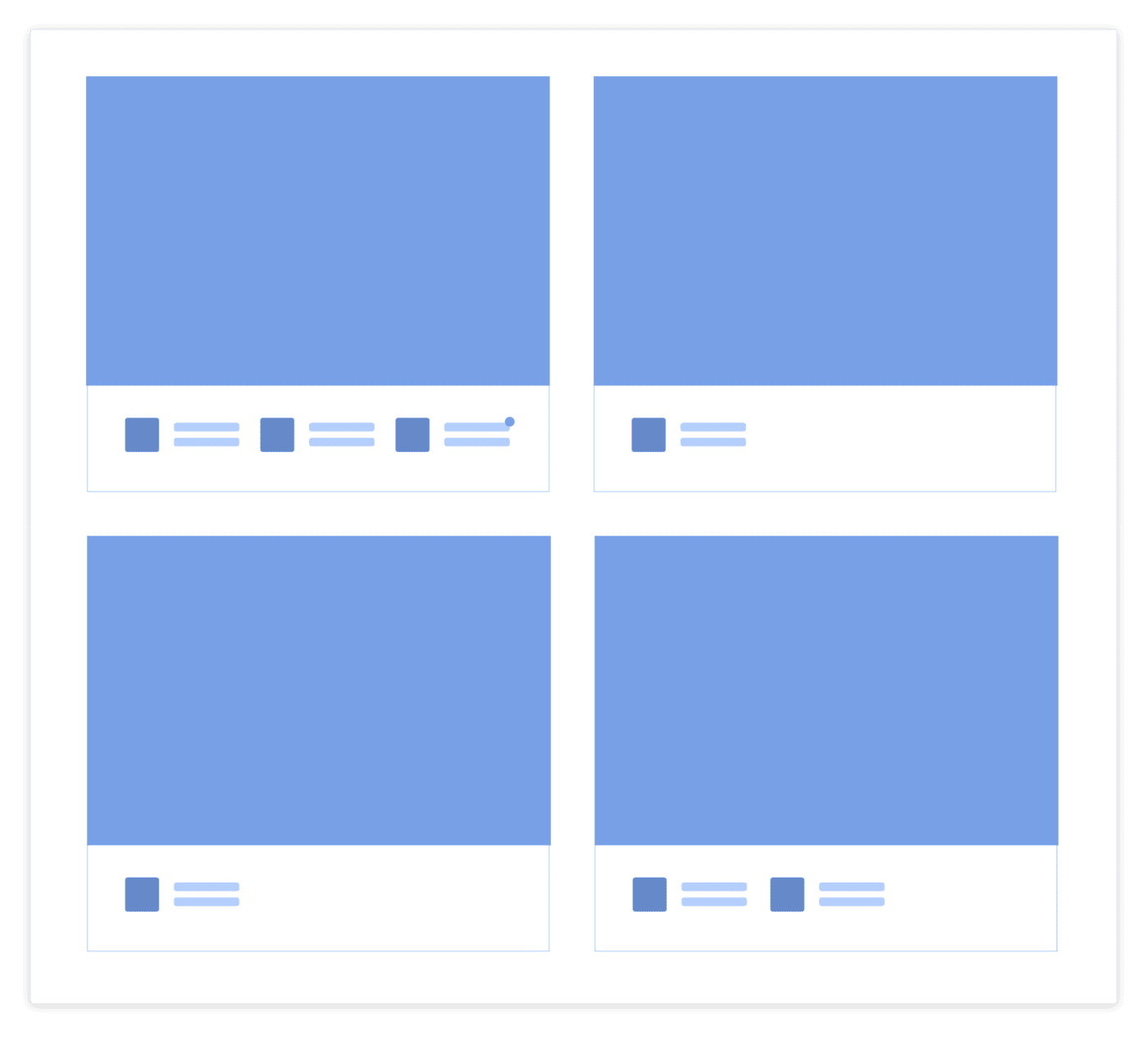
In our Design solution using Proximity, I removed the distance between Title, and Link by making them closer using center alignment. In this way, we are able to tie up the 3 elements together (Image, Title, Link), which helped us to resolve our missing context problem.
- Similarity
Similarity occurs when objects look similar to one another. People often perceive them as a group or pattern. Source: graphicdesign.spokanefalls.edu
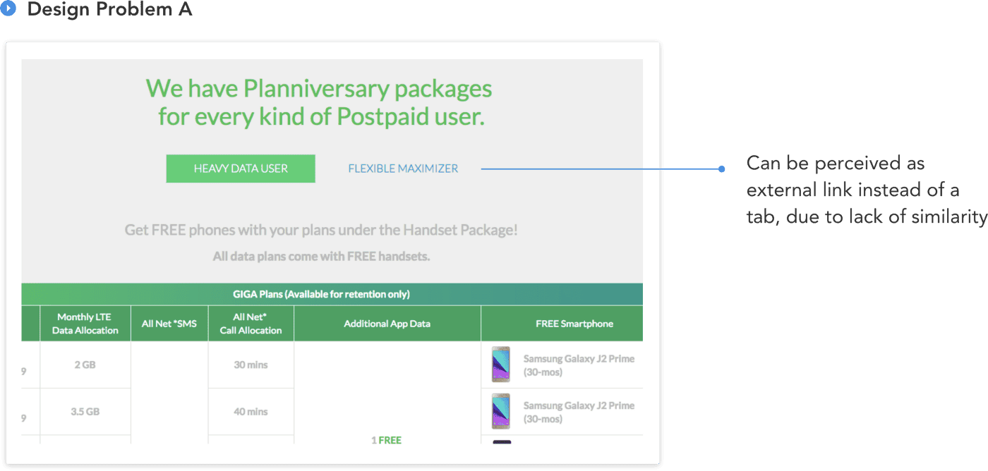
In Design Problem A below, I’ve pointed out the blue text color. The reason for that is, on user interaction, Heavy Data User and Flexible Maximizer are related — they are actually Tabs user interface 😱
What Makes These Two Elements Unrelated to Each Other?
The answer is: many things. But on a simpler note, nothing binds these two elements together which makes them look individually alone. As we can see, it is pretty obvious that the branding colors of the interface are green, but suddenly a blue text color pops out from nowhere. Thus, the Law of Similarity comes in:
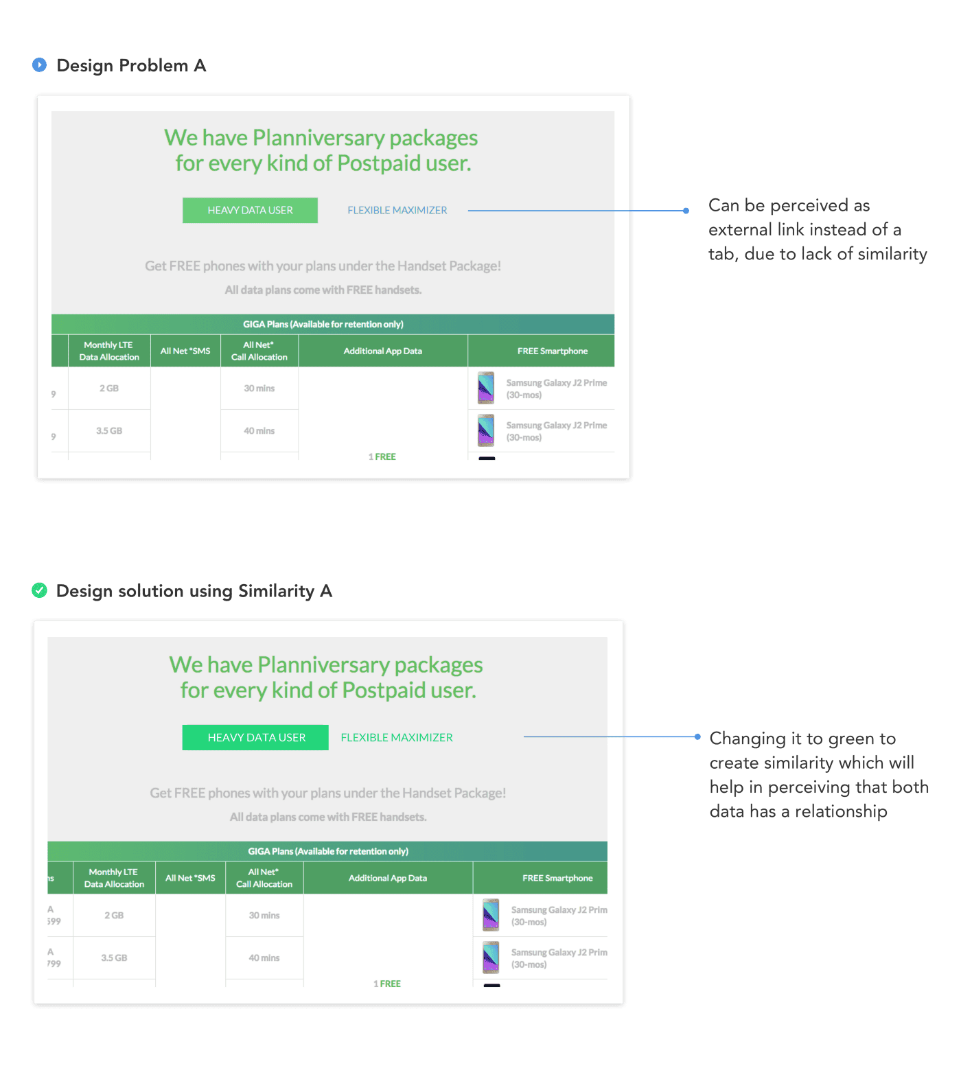
As our solution, I created similarity by making the text color green and adding left and right padding to our active state, so that it will be in closer proximity to the other tab, Flexible Maximizer.
This Design Problem A, can be furthermore improved by redesigning it (this will really need redesigning) so that it can simplify the user’s experience more. But for now, let’s just take the least minimal step in making it better using Similarity 😉
There is also another way to incorporate Similarity — Approach 2:
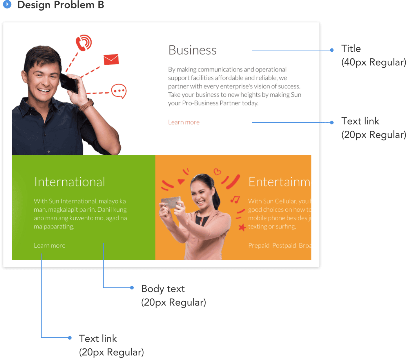
Now in Approach 2 let’s observe its nitty-gritty parts — the Type system which are:
- Title: 40px Regular
- Body text: 20px Regular
- Text link: 20px Regular
At first glance, we might think that this is just an ordinary Type system that we could ignore. But as we look closer, the problem occurs between Body text and Text link, both are sharing the same Type system (20px Regular) which could lead to user confusion and lack of user trust. As they navigate through the site, they might hesitate, do trial and error if what they’re interacting with is a body text or a text link.
Okay, So How Do We Solve This?
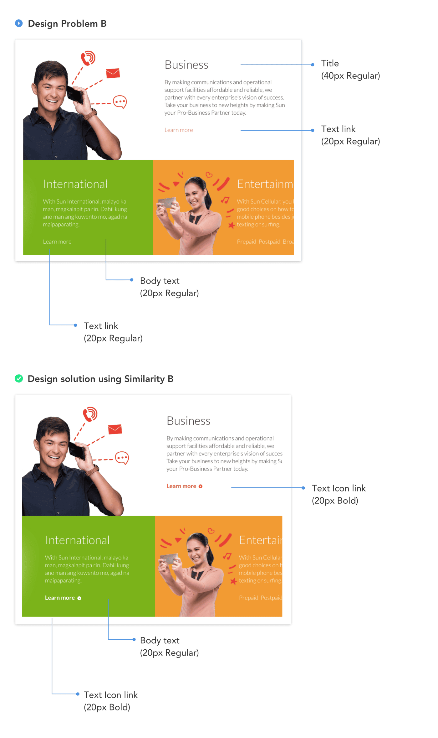
As our Similarity solution, we need to tweak the Type system a little bit:
- Title: 40px Regular
- Body text: 20px Regular
- Text Icon link: 20px Bold
We added contrast in our type by making the Text link bolder, and an icon for visual dominance. By making these changes, we created homogeneity throughout the Text Icon link and made our user’s cognitive load faster.
Out of topic quick tip: In creating a Type system, choose a font that has various weights (thin, light, regular, bold etc). Our goal should not be various font sizes with few weights for better contrast, but to have few font sizes with various weights. For more click here.
- Focal Point
Focal points are areas of interest, emphasis or difference within a composition that capture and hold the viewer’s attention. Source: Smashing Magazine
In Focal Point, we’ll be showing two Design Problems in action:
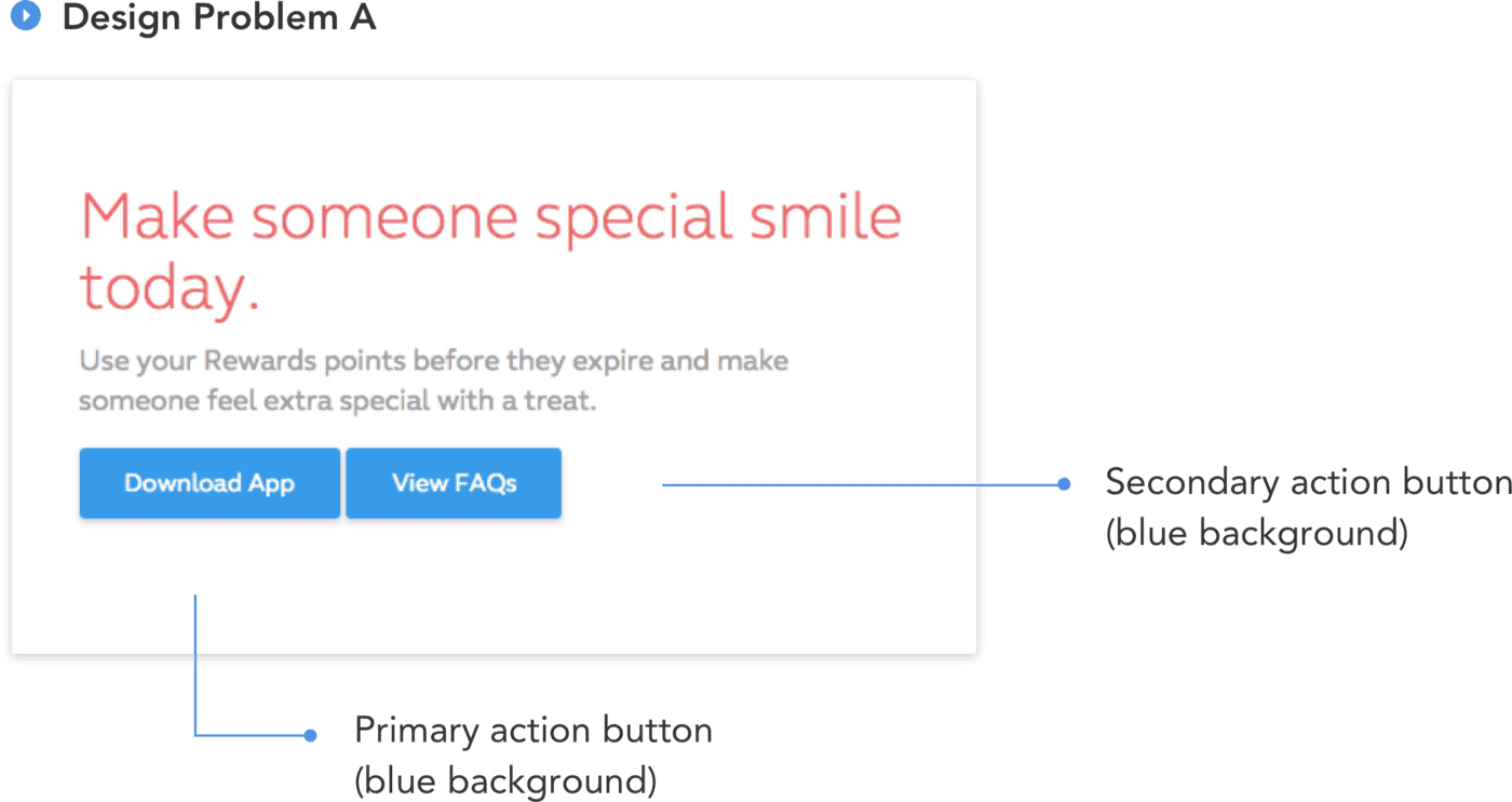
In the example above, there’s actually no problem with how the elements were laid out. But it is the information hierarchy that we have — primary action and secondary action share the same button system.
We can see that the goal of this interface is for users to download the app and that the FAQ is a supporting document to give users a better understanding of their application (and yes, I doubt that they want the users to read FAQs than to download).
Therefore, as our solution:
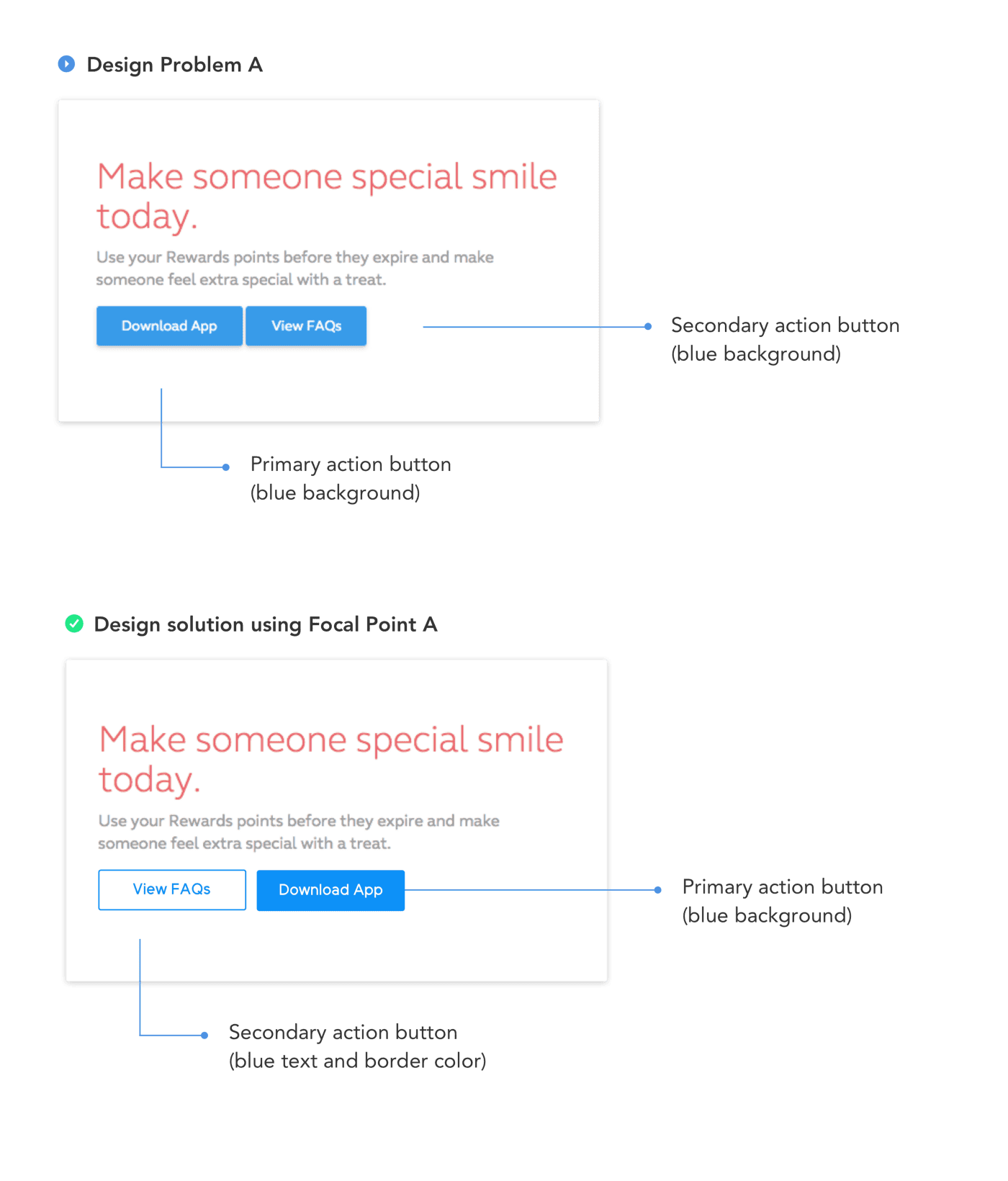
Using focal point, I changed the View FAQs button interface into a border button, to give the Download App button the spotlight effect it needs. Also, I interchanged their order, having the Primary action on the right and secondary on the left. The reason for this is following the Gutenberg Diagram. It says that:
Based on this theorem, the two spots on the right (at the first point of the “Z” and the very end of it) are where visitors expect to take action. So there’s really no question here as to where your call-to-action belongs in terms of right or left. It should always be towards the right side of the screen.
Also just to add something out of topic, a common button design problem we can usually see is, creating one kind of button interface for different functionalities (Fill buttons for Sign-ups, Cancel, Load more, Read more, etcetera).
Isn’t It Good If It Creates Consistency?
Yes, we all know that consistency plays a huge role in UX design but there’s what we call Consistency by Functionality. If we will create the same kind of button design to cater to different functionalities, it can lead to user’s inconsistent experience, and also might affect our client’s business goals.
Out of topic quick Tip: Button design consistency = Button Functionality.
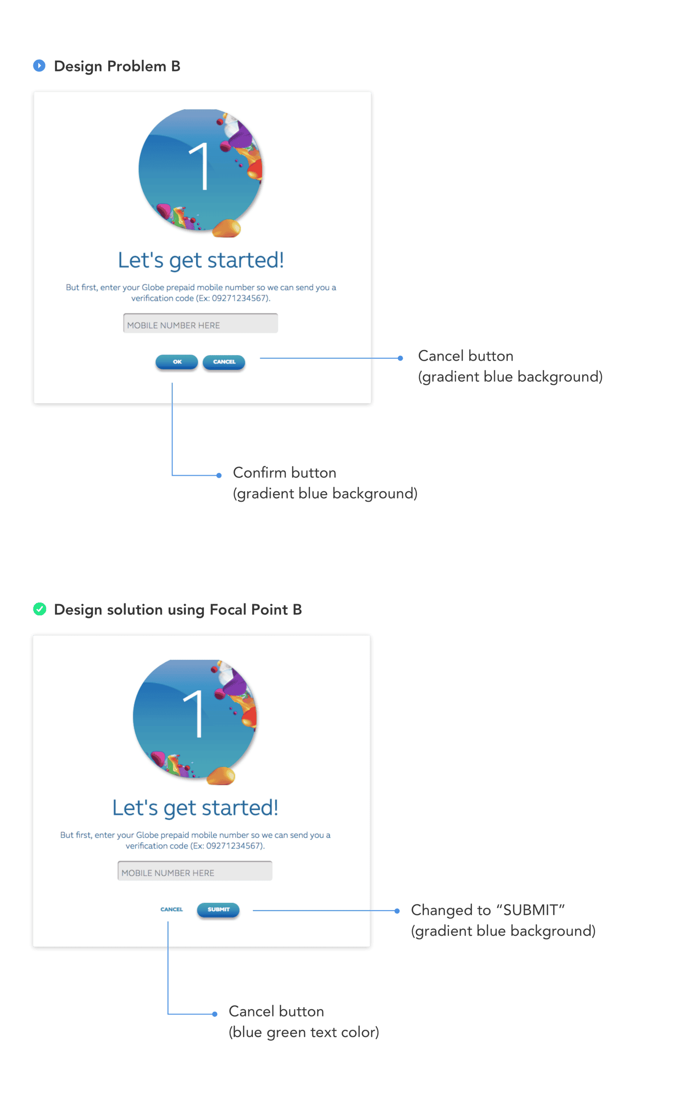
Now moving to Approach 2 application:
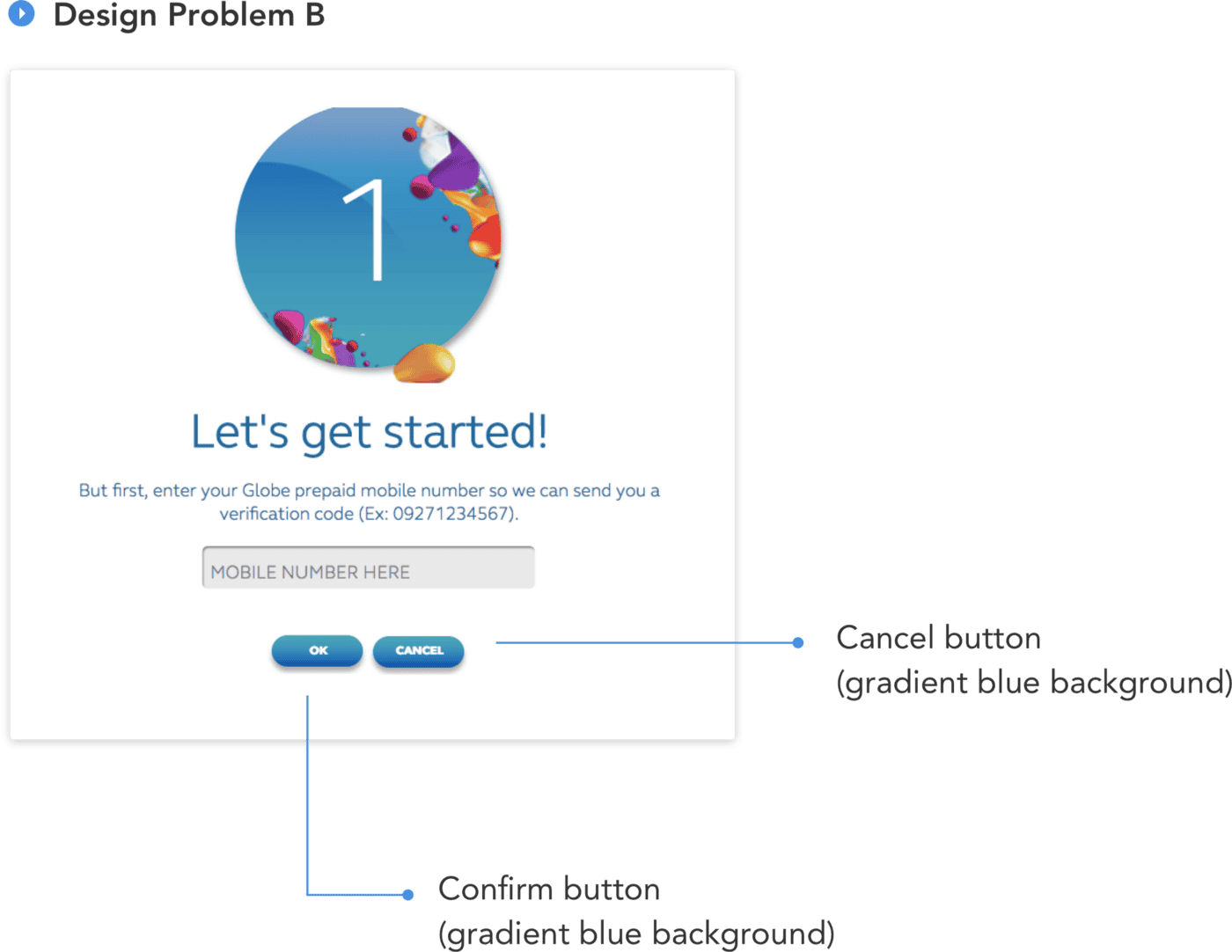
The same problem occurs in this design. OK and Cancel button shares the same design style, which requires them to read thoroughly the button labels so that they’ll be able to know which is for Submission and Cancellation.
And using Focal Point, we lessen their time in reading through the labels, which leads us to Design Solution B:
- Common Region
The principle of common region is highly related to proximity. It states that when objects are located within the same closed region, we perceive them as being grouped together. Source: User Testing
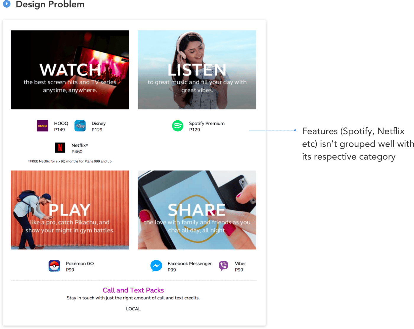
The features like Spotify, Disney, Netflix aren’t grouped together with their category and seemed to be floating elements. And to make it much simpler, creating a wireframe out of it would look like this:
From the wireframe above, it is more likely numerous individual elements than 4 whole components. Thus as a solution, Common Region Principle:
In the wireframe, we used a box border to enclose all the features to their respective category, so that they will be seen as one instead of individual elements. And below is the implementation:
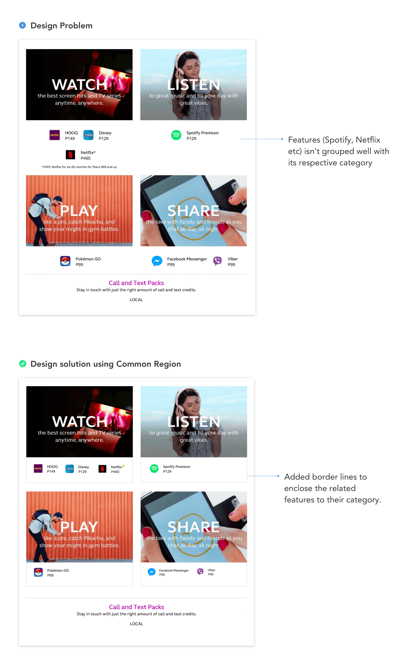
Aside from the bounding box, we replaced the *Free Netflix for six (6) months for Plans 999 and up with an information icon at the upper right side of the Netflix element (color yellow icon) to create more room for the feature list, that once clicked, a tooltip will appear.
And yes, that’s the 4 Gestalt Principle that can save your design day ☀️ There’s more Gestalt Principle you can use as your solutions. Thus, share them in our responses section if you have solved one using them. And I hope this article helped you. For questions, just say Hi at mhariellmosqueriola@gmail.com
Happy Designing everyone!
- For more articles, subscribe to our Magazine Newsletter.
- Follow us on Facebook, Twitter and LinkedIn.
- Join the Community on Slack and Facebook.
- Listen to our Podcast on Apple Podcasts, Google Podcasts and Spotify.
If you want to contribute to Phase Magazine, write to us here:
Start Animating
Get Started with Our Free, Web-Based Platform.
© Phase Software GmbH 2024