✍️
Note
Heads up! Phase gets little updates and improvements all the time. Our tutorials might be a tad different from the current app.
Shapes
Shapes are the foundation for creating designs and animations in Phase. Sure, rectangles and ovals are the simple ones built into the interface. But the real power is being able to reconstruct and edit these basic shapes however we see fit.
Creating Shapes
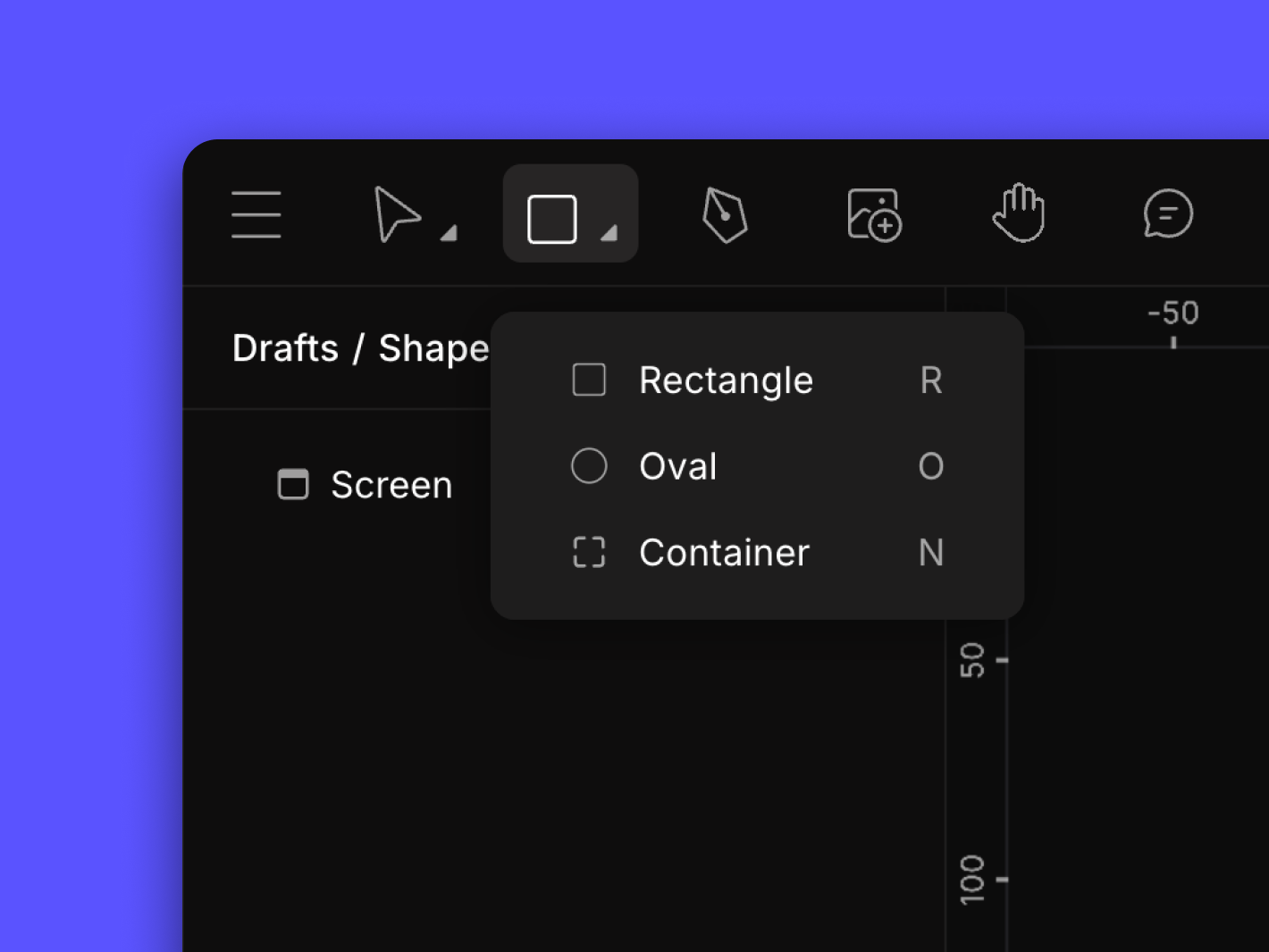
Creating a Circle
- Select a shape from the shape tool dropdown. In the example above, an oval was chosen.
- Click on an area on the canvas to start. Then, we drag in the direction we want to expand the shape toward. To make the dimensions stay equal (like a square or a circle), hold while dragging.⇧ Shift
✍️
Note
Clicking instead of dragging will result in a 100x100 pixel shape.
Shape Types
Phase offers more than just rectangles and ovals. We also have containers. They're available in the same menu, and can be created the same way. Containers are useful for grouping components to keep our design organized. For more information on how containers work, read our dedicated article article.
In addition to basic shapes, we can draw custom vector shapes using paths. Create stars, triangles, hearts and more by using the pen tool to draw a path and then convert it into a custom shape. However, shaping paths takes more skill than adding basic rectangles or ovals.
The Layer Panel
Toggling element visibility and viewing layer hierarchy
In Phase, the Layer Panel acts as our central hub for organizing shapes and elements in our project. It provides a clear view of all layers, helping us navigate and edit designs efficiently.
Hierarchy and Structure
The Layer Panel displays a structured hierarchy of layers, which represent the order and arrangement of elements on the canvas. Elements are organized in a parent-child relationship. This hierarchy plays a crucial role in determining the stacking order and visibility of elements in our final design.
Element Identification
Each layer in the panel has its own icon and label, making it easy to identify and tell the difference between different types of elements. Icons often convey the type of layer ( e.g. Oval  , Container
  , and Rectangle
  ) and provide visual cues about the layer's properties, such as its visibility or locked status.
, Container , and Rectangle ) and provide visual cues about the layer's properties, such as its visibility or locked status.When using Mask groups, a small circle appears next to the top layer to show the mask definer. This circle is connected by a vertical line to other elements in the group, making it easy to identify and manage our masking structures.
Interactive Features
The Layer Panel comes with some handy features that make our workflow easier. For starters, we can rename layers, toggle their visibility and even lock or unlock them. Plus, we can adjust their stacking order—all directly from the panel. This amount of control allows us to be more precise with our designs.
Creating a shape is only half the fun, we've got to edit it too! Click on the shape to reveal the element Properties Panel. This is where customization takes place.
📖
Read More
Learn how to edit Shapes using the Properties Panel.
Start Animating
Get Started with Our Free, Web-Based Platform.
Learn
© Phase Software GmbH 2025