Building Better UX with High-Fidelity Prototypes

Paul Boag
Paul specializes in UX prototyping, applying innovative design thinking and user-centered principles to refine digital products and ensure intuitive interactions.
High-fidelity prototypes bring designs to life, offering realistic user testing, clearer stakeholder communication, and smoother developer handoffs.
When I talk about UX design, one topic that always comes up is prototyping. And within that, the conversation often turns to high-fidelity prototypes. I remember a time when prototypes were just static screens, maybe with a few hot spots if you were feeling fancy. But things have changed quite a bit, haven't they? I've seen firsthand how high-fidelity prototypes can truly transform the design process, making our work clearer, more collaborative, and ultimately, more impactful. But, like anything in design, it's not a one-size-fits-all solution. There's a time and a place for everything, and understanding that is key.
What are High-Fidelity Prototypes?
So, what exactly are we talking about when we say "high-fidelity prototypes"? Think of it like this: if a low-fidelity prototype is a quick sketch on a napkin, a high-fidelity prototype is a meticulously crafted architectural model. It's about bringing your design as close to the final product as possible without actually writing the full code.
When I talk about low-fidelity prototypes, I'm usually thinking about things like simple sketches, basic wireframes, or even just some sticky notes arranged on a whiteboard. These are fantastic for getting initial ideas down quickly, exploring different layouts, and hashing out basic user flows. They are about speed and exploration, not polish.
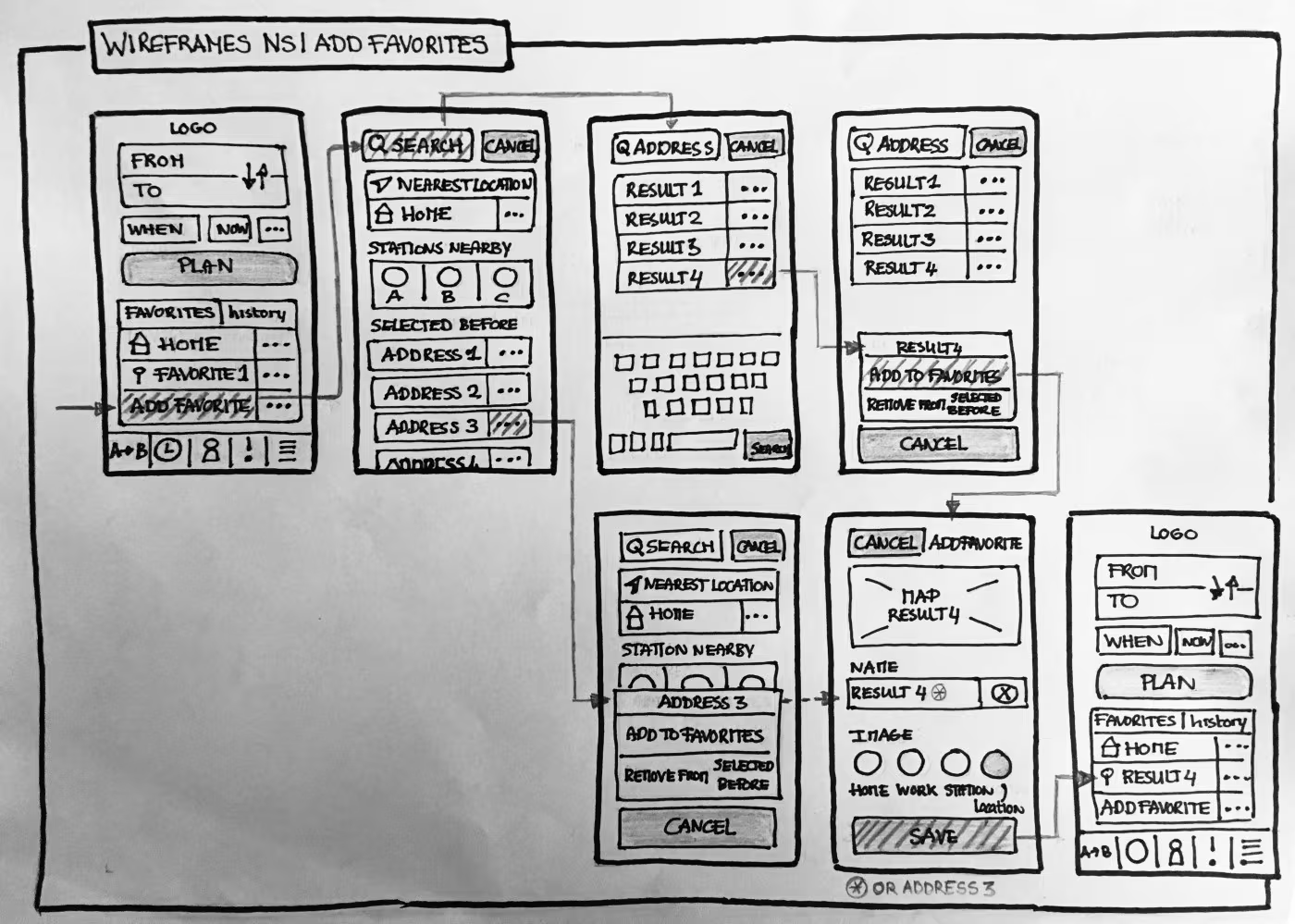
Low-fidelity wireframes are typically quick sketches or greyscale (image credit: Wireframing NS)
High-fidelity prototypes, on the other hand, are a different beast entirely. They are detailed, interactive, and visually refined. Imagine a prototype that looks and feels almost identical to the finished application or website. That's what we're aiming for here.
Let me break down some of the key characteristics to look for in a high-fidelity prototype:
- Realistic UI Elements: This means using the actual colors, typography, imagery, and icons that will appear in the final product. No more grey boxes and placeholder text. We're talking about the real deal here. It's about making it feel like something you could actually use.
- Interactive Flows and Sophisticated Animations: High-fidelity prototypes don't just show screens; they show how users move between those screens. They include all the buttons, forms, sliders, and other interactive elements that a user would encounter. And crucially, they often incorporate complex micro-interactions and UI animations that bring the experience to life. Think about a subtle bounce effect on a button press or a smooth transition between different sections of an app. These details make a big difference.
- Near-Final Look and Feel: The goal is to make it feel almost finished. This isn't just about visual aesthetics; it's about the overall experience. Does it feel responsive? Is the navigation intuitive? Does it evoke the right emotions? These are the questions a high-fidelity prototype helps us answer.
- Realistic Content: While it doesn't need to be final copy, the content should closely mirror what users will see in the finished product. Using AI tools can help generate appropriate placeholder content that feels authentic and matches the tone of your product, rather than using lorem ipsum text.
I find that the more realistic a prototype is, the more genuinely users interact with it, and the more accurate their feedback becomes. It's like the difference between imagining a car from a blueprint and actually taking it for a test drive. One gives you a general idea; the other provides a real feel for the experience.
High-fidelity mockups should have realistic UI, interactive elements and genuine content.
Next, let's explore why this level of detail, while sometimes more work, can be incredibly beneficial for a project.
The Pros and Cons of High-Fidelity Prototypes
It's tempting to think that "more fidelity" always means "better," right? I certainly used to lean that way. But over time, I've learned that it's all about choosing the right tool for the job. High-fidelity prototypes, while powerful, aren't always the answer. Sometimes, a quick sketch or a basic wireframe is exactly what you need. It's about being pragmatic, and understanding when to use each approach.
So, let's talk about when high-fidelity prototypes really shine, and also when you might want to pump the brakes a little.
The Advantages of High-Fidelity Prototypes
Let me share some key benefits I've seen with high-fidelity prototypes:
Enhanced User Testing and Feedback Accuracy:
High-fidelity prototyping is incredibly valuable for user testing. When you put a polished, interactive prototype in front of a user, their reactions are incredibly realistic. They aren't trying to connect the dots in their head from abstract shapes or imagining how a button might feel. Instead, they are interacting with something that looks and behaves very much like the final product.
Think about it: if you show a wireframe with "button" written on it, you'll get feedback on the concept of the button. But with a beautifully styled, animated button that responds like it will in the live app, the feedback becomes much more authentic. Users will comment on the animation, the feel, the micro-copy; the whole experience. This drastically reduces the cognitive load for users. They don't have to try and imagine how something will work. They just use it. This means the feedback you get is more granular, more specific, and ultimately, more valuable.
Usability testing tools like Maze and Useberry make it incredibly easy to test high-fidelity prototypes. These tools allow designers to quickly gather accurate feedback on complex interactions and user flows through realistic testing environments. The ability to simulate the actual user experience, rather than just showing static screens, provides much more valuable insights during user testing sessions.
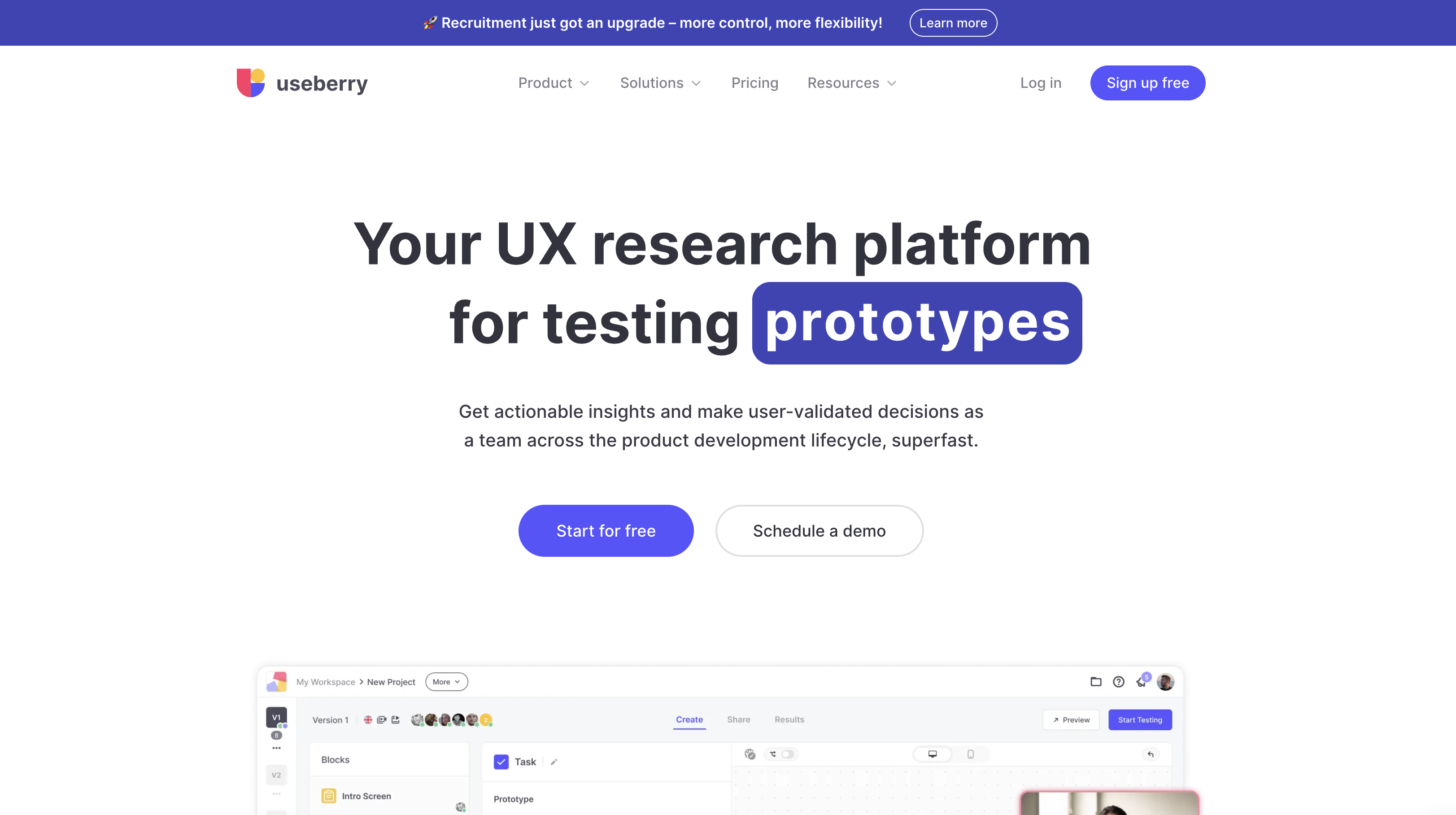
Usability testing tools like Maze and Useberry make it incredibly easy to test high-fidelity prototypes.
Improved Stakeholder Communication and Buy-in:
Have you ever tried to explain a complex user flow to someone who isn't a designer, using only wireframes? It can feel a bit like trying to explain a dream. They might nod politely, but you can see the confusion in their eyes. High-fidelity prototypes solve this beautifully.
When non-designers (be they clients, developers, or project managers) see a prototype that looks and feels like a real product, they "get" it immediately. There's far less room for misinterpretation. Everyone gets on the same page much faster because they are all looking at and interacting with the same near-final vision. It builds confidence and secures buy-in more effectively. When presenting a high-fidelity prototype, the conversation shifts from "What will it look like?" to "How can we make this even better?" That's a great place to be.
Tools like Phase's real-time collaborative features make it easy for teams to work together on prototypes. With multi-player editing, inline commenting, and version control, teams can bridge the understanding gap between design intent and final product more effectively. This collaborative approach makes presentations more impactful and helps secure stakeholder buy-in faster.
Streamlined Developer Handoff:
This is where high-fidelity prototypes can really save a lot of headaches, both for designers and developers. When you hand off a high-fidelity prototype, you're not just giving them a set of static screens. You're providing a living, breathing guide.
The prototype acts as a clear specification, showing exactly how elements should look, how they should behave, and how users should flow through the experience. This significantly reduces guesswork for developers. They can interact with the prototype, understand the intended micro-interactions, and see how dynamic elements are supposed to work. This means less back-and-forth, fewer questions, and ultimately, much less rework. It's almost like giving them a working model to build from.
Modern prototyping tools like Phase offer features such as "production-ready UI code exports." This can be a game-changer, as it means the design isn't just a visual concept; it's translated directly into clean, semantic code. This reduces developer effort substantially and minimizes the common discrepancies that pop up between design and implementation. It's like speaking the same language, which makes everyone's life easier.
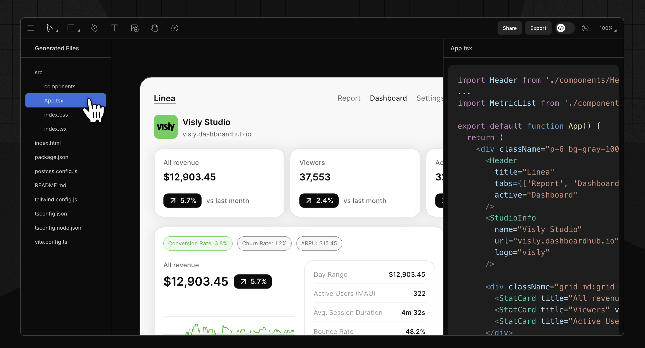
Prototyping tools that have UI code export dramatically improves hand over to developers.
More Accurate Cost and Time Estimates:
Let's be honest, estimating project timelines and costs can feel a bit like throwing darts in the dark sometimes. But when you have a high-fidelity prototype, that dartboard becomes much clearer.
Because the prototype shows so much detail (the complexity of interactions, the specific animations, the overall scope of the design) it gives a much better understanding of the work involved. This leads to more precise project planning. You can identify potential technical challenges or areas of high complexity much earlier in the process. This foresight is invaluable because it helps to reduce that dreaded "scope creep" later in the development cycle. It means fewer surprises down the line, which makes project managers, and frankly, everyone involved, much happier.
Superior Animation and Interaction Fidelity:
This is an area where specialized tools make a world of difference. Many general design tools offer some basic prototyping features, usually click-throughs and perhaps some simple transitions. But when you need to create complex, dynamic animations and intricate micro-interactions, those tools often fall short.
Tools like Phase are purpose-built for bringing complex movements and subtle details to life. They enable the creation of intuitive animations and sophisticated UI motion effects that allow designers to craft compelling user experiences that are simply difficult or impossible to achieve with simpler click-through prototypes. This means you can test not just the usability of a flow, but also the emotional impact of fluid transitions and engaging interactions. It's the difference between a functional interface and a delightful one.
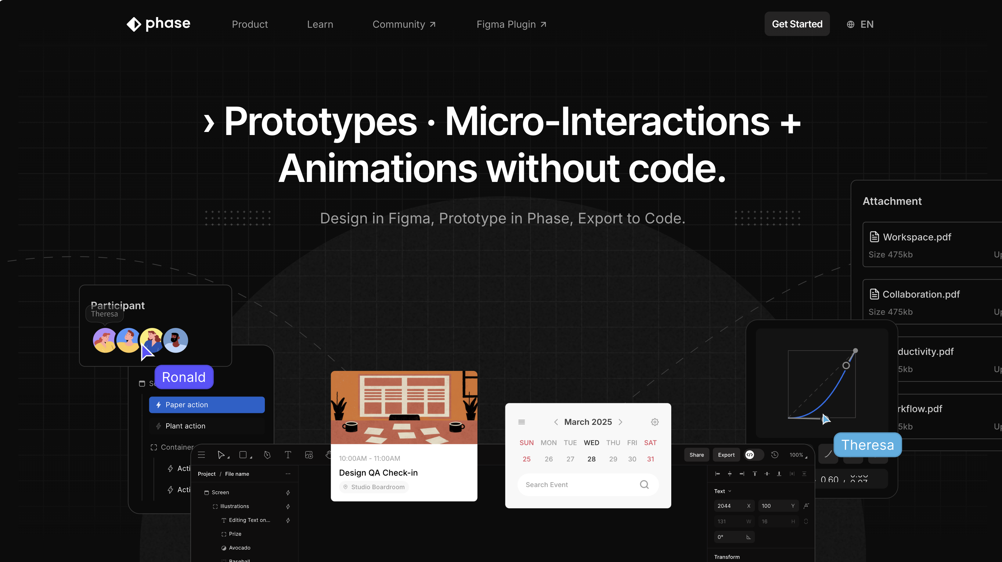
Tools like Phase allow designers to build prototypes that truly behave like real websites and apps.
Now, as much as I sing the praises of high-fidelity, it's important to keep our feet on the ground and acknowledge when it might not be the best approach.
The Drawbacks of High-Fidelity Prototypes
I've learned that there are times when such detailed prototypes would be overkill. High-fidelity prototypes, while powerful, require significant investment.
Here are a few scenarios where I find myself reaching for a lower-fidelity option:
- Early-Stage Ideation & Exploration: When I'm just brainstorming or trying to figure out the basic structure of something new, going high-fidelity would slow me down way too much. At this stage, I need speed and agility. I want to be able to sketch out 10 different ideas in an hour, not spend a day on one. Low-fidelity is perfect for throwing ideas at the wall and seeing what sticks. It's about quantity and rapid iteration.
- Rapid Iteration for Minor Changes: Let's say we've done some user testing, and we just need to tweak the wording on a button or slightly rearrange a few elements on a screen. Do I need to update a full high-fidelity prototype for that? Probably not. A quick sketch or an annotated wireframe might suffice to communicate that minor change to the team. It's about efficiency.
- Time & Resource Constraints: Let's face it, we don't always have unlimited time and resources. Creating high-fidelity prototypes takes more effort, more time, and sometimes more specialized tools and skills. There are definitely situations where "good enough" is, well, good enough. If the budget is tight or the deadline is looming, sometimes we have to prioritize getting something functional out the door rather than something perfectly polished for every stage. It's about making smart trade-offs.
So, while high-fidelity prototypes offer incredible benefits, it's crucial to understand when they are truly the right fit. It's about being mindful of your goals and your constraints. This leads us to the next point: figuring out when exactly to pull out the big guns.
When to Produce a High-Fidelity Prototype
Knowing when to create a high-fidelity prototype is a bit like knowing when to use a fancy espresso machine versus a simple drip coffee maker. Both make coffee, but one is for a specific, more refined experience. I've learned through trial and error that timing is everything. Here are the scenarios where I almost always reach for the high-fidelity approach:
- When stakeholders are struggling to picture what the final deliverable will be. This is probably the most common scenario I encounter. You've explained the vision, you've shown them wireframes, but they just can't quite visualize the end product. Perhaps they're non-technical, or maybe the concept is particularly innovative. This is when a high-fidelity prototype truly shines. It removes all ambiguity, allowing them to see, touch, and feel something close to the finished design. It fosters confidence and helps them connect with the vision.
- When using external developers with limited communication channels. If you're working with a development team that's remote, or perhaps one where you don't have constant, in-person communication, a high-fidelity prototype becomes an indispensable communication tool. It acts as a comprehensive living specification. Every interaction, every animation, every detail is laid out explicitly. This minimizes misunderstandings and reduces the need for constant clarification, saving both time and potential rework down the line. It's like sending them a detailed instruction manual they can actually play with.
- When you need to test the impact of aesthetics or the complexity of interactions. Sometimes, the look and feel, or the intricate way users interact with something, is central to the experience. Think about an app where beautiful animations are part of the brand, or a complex dashboard with many dynamic data visualizations. In these cases, testing with low-fidelity simply won't give you the answers you need. You need to see how users react to the visual polish, the subtle transitions, and the flow of complex interactions. A high-fidelity prototype lets you truly put these elements to the test.
- Showcasing Micro-interactions & Animations: This goes hand-in-hand with the previous point. When micro-interactions—those tiny, often subtle animations that provide feedback or delight—are a key part of the user experience, a high-fidelity prototype is essential. This is especially true for those interactions that require precise timing and specific behavior. Tools like Phase excel at these kinds of details. You can't truly evaluate the effectiveness or emotional impact of these elements until you see them in action.
- For validating complex user flows and states that require dynamic responses, beyond simple screen transitions. If your user journey involves conditional logic, dynamic data displays, or multiple states that change based on user input, a simple click-through prototype just won't cut it. You need a prototype that can mimic those dynamic responses. This allows you to validate whether your complex flows actually make sense and whether users can navigate them effectively. It's about ensuring the logic holds up under realistic interaction.
So, to summarize, I generally opt for high-fidelity when clarity, precision, and a realistic testing environment are paramount. It's about investing in the right level of detail to get the right kind of feedback and ensure a smooth path to development. This brings me to how I approach building these kinds of prototypes.
How to Produce a High-Fidelity Prototype
Okay, so we've talked about what high-fidelity prototypes are and when to use them. Now, let's talk about how to go about making them. It's not about jumping straight into the deep end! It's a process that benefits from a few thoughtful steps.
Start with Low-Fidelity
This is a point I really want to emphasize. Never start a project by diving straight into high-fidelity. That would be like trying to paint a masterpiece before you've even sketched out the basic composition. It's messy, it's inefficient, and you'll probably end up tearing your hair out.
The process always begins with low-fidelity. We're talking sketches, basic wireframes, rough user flows. This is where you quickly explore ideas, validate core concepts, and make sure the basic structure and user journey make sense. It's incredibly fast to iterate at this stage. If something isn't working, you can scrap it and redraw it in minutes, not hours or days. This iterative process is crucial. You want to iron out the big structural and flow issues when it's cheap and easy to do so. Only once you're confident in the foundational design should you start thinking about adding layers of polish using specialized tools like Phase.
Focus on Key User Flows
Even with high-fidelity, I rarely build out every single screen and every single interaction. That would be a huge undertaking and, frankly, often unnecessary. Instead, I prioritize. I identify the absolute core user flows—the critical paths that users will take to achieve their main goals.
For example, if I'm designing an e-commerce app, I'd focus on the user journey from Browse products, adding to cart, and checking out. I might also build out the login/signup flow. These are the parts that absolutely must work flawlessly and feel great. By focusing my efforts on these key areas, I can ensure that the most important parts of the experience are fully realized, without getting bogged down in every edge case or less critical feature. It's about getting the most bang for your buck, so to speak.
Use Real Content
This might seem like a small detail, but it makes a massive difference. When you're creating a high-fidelity prototype, avoid using "lorem ipsum" or dummy placeholder text. As much as possible, use real content—actual headlines, real product descriptions, genuine user comments.
Why? Because real content makes the prototype instantly more relatable and effective. Users aren't distracted by trying to decipher generic text; they can focus on the design itself. Real content also often reveals design challenges you might not have anticipated. Perhaps a headline is much longer than you expected, or an image size doesn't quite fit the layout. Catching these things in the prototyping phase is far better than discovering them during development. It helps the prototype feel truly authentic.
Leverage Specialized Tools for Interactivity
Once those core flows are established and I have a good handle on the visual design, that's when specialized prototyping tools come into play. While I might start my initial designs in a tool like Figma for static screens and basic layouts, dedicated prototyping tools like Phase really come into their own when it's time to add those layers of high-fidelity animation, dynamic interactions, and realistic behavior that truly bring the prototype to life.
These specialized tools offer powerful capabilities for advanced animation and complex UI motion. They allow designers to craft nuanced micro-interactions, precise timings, and delightful transitions that make the user experience truly engaging. It's about choosing the right tool for the job. While Figma is great for the initial visual design, when you need to make something move and feel real, a dedicated tool for interactivity is the way to go.
By following these steps, I find that I can create high-fidelity prototypes efficiently and effectively, ensuring they provide maximum value without excessive effort. It's about a smart, iterative approach that builds from simple foundations to a rich, realistic experience.

Start Prototyping
Get Started with Our Free, Web-Based Platform.
© Phase Software GmbH 2025